Results
After a search, the Results workspace shows the ranked solutions: a large refinement chart on the left and an inspector column on the right.
Refinement chart
The main canvas is an interactive Plotly Rietveld plot with the standard four traces (colour-keyed in the header legend):
- Observed — measured data points
- Calculated — the refined model
- Background — fitted background
- Difference — observed − calculated, offset below
Plus per-phase Bragg tick rows marking each phase's reflection positions.
Chart toolbar
| Tool | Action |
|---|---|
| Pan | Drag to pan (mutually exclusive with Zoom) |
| Zoom | Drag a box to zoom — the default mode |
| Log Y | Toggle logarithmic intensity axis — handy for weak minor phases |
| Camera | Save the current chart as a standalone interactive HTML file |
Double-click the chart to reset the view.
Batch file selector
For batch runs, a combo box in the chart header switches between the per-file result sets.
Inspector column
| Section | Content |
|---|---|
| Solutions | The ranked list. Click a row to load that solution into the chart and all sections below. |
| Fit quality — Rank n | Metric cards: Rwp, Rexp, GOF, Rp. Rwp and GOF are colour-toned (good / warn / bad) for at-a-glance quality. |
| Phase composition | One bar per phase with its weight fraction (± ESD where available). |
| Lattice parameters | Refined cell parameters, volume, and space group per phase. |
Export footer
Pinned at the bottom of the inspector:
- Export ▾ — Plot data (tab-separated
.txtwith the full profile + reflections), a Publication figure (Origin-style Rietveld plot as 300-dpi PNG or vector PDF/SVG), Interactive plot HTML, or a text Report. - Open .lst — the raw BGMN refinement output for the selected solution, in a viewer with save/export.
The same exports are available from File → Export current solution and the
MCP server's export_solution.
Publication figure
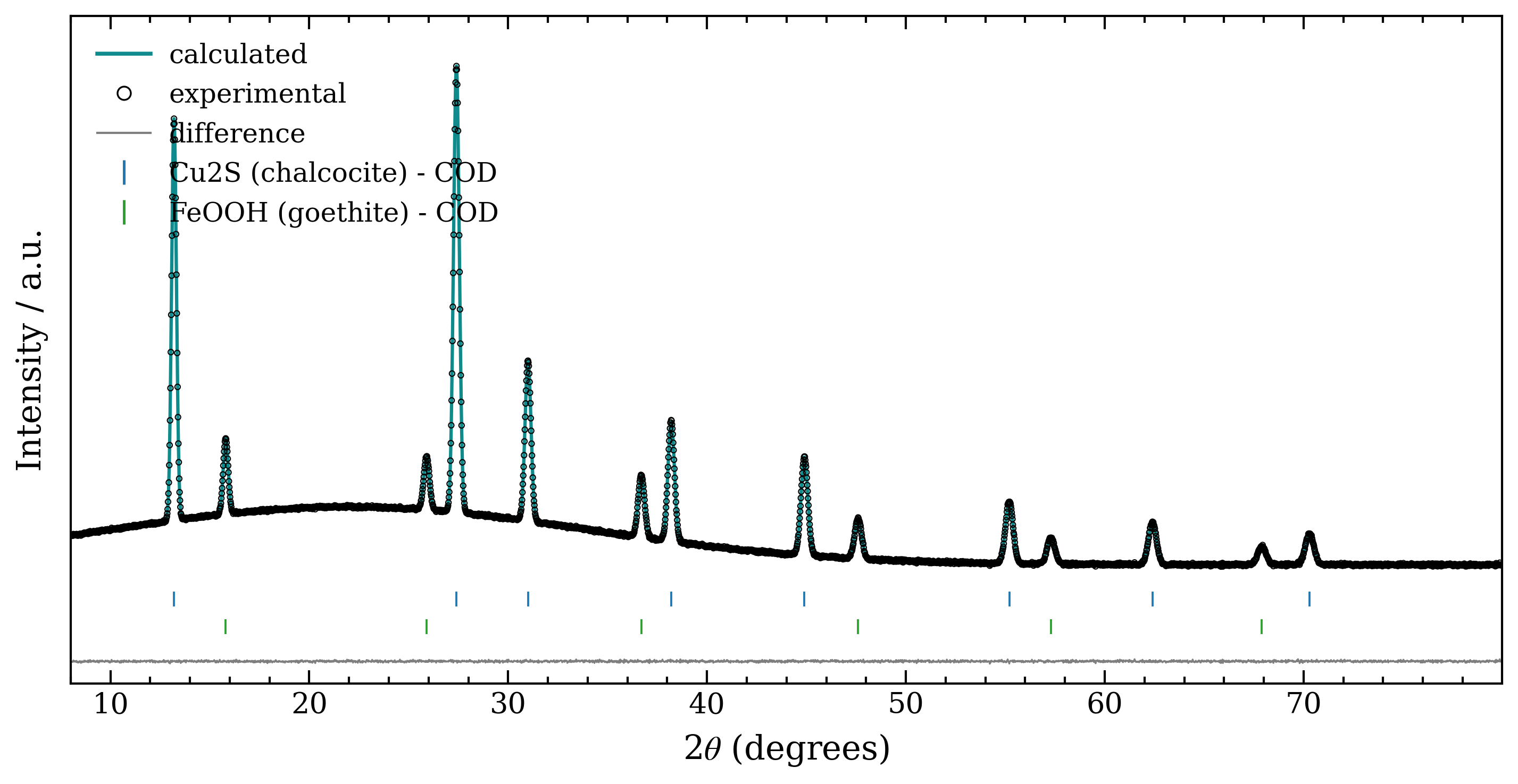
The Publication figure export renders an OriginLab-style Rietveld plot — a teal calculated line, open experimental circles, one colour-coded Bragg tick row per phase, and an offset difference curve, in a Times-serif boxed frame — ready for a manuscript. Save it as a 300-dpi PNG or as scalable vector PDF/SVG.
Judging a solution
- Rwp → Rexp — the closer, the better; GOF near 1 is ideal.
- Inspect the difference curve — systematic wiggles mean a missed or wrong phase; noise means a good fit.
- Check the phases are chemically plausible for your sample.
- Suspicious minor phase? Re-refine without it and compare Rwp.
No solutions?
If the list shows "No phases could be matched", widen the chemical system, add candidate CIFs, check the instrument profile, or try the exhaustive search.